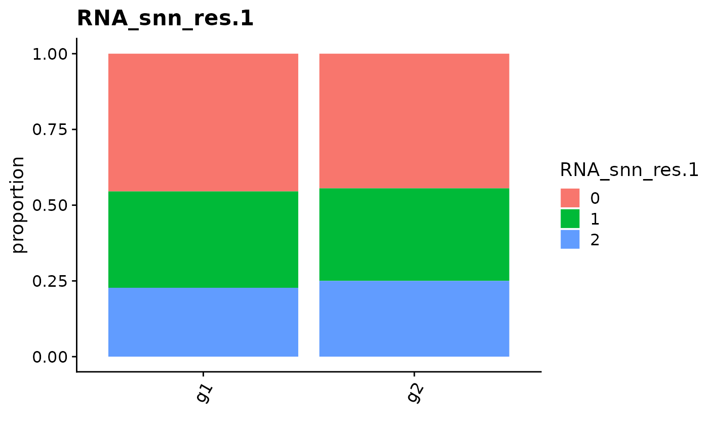
Plot cell proportion
CellPropPlot.RdThis function will generate a bar plot to visualize the cell proportion across different samples
CellPropPlot(object, group.by = NULL, prop.in = NULL, cols = NULL)Arguments
- object
Seurat object
- group.by
Name of one metadata column to group the cells
- prop.in
Name of one metadata column to compute the cell proportion
- cols
Specific colors for plotting
Value
A ggplot object